Upgrading Kirby CMS for Blogging
Kirby's a great CMS -- but it's pretty barebones. With our recent switch to Kirby as our static based CMS in the wake of Wordpress, I've been slowly fleshing out the framework with much needed functionality. From simple things such as tags for posts, or even archive vs single pages (Kirby just stacks your single posts for archives by default...???...profit?).
So today we rolled out a more fleshed out blog, as well as some stylistic and mobile optimizations I'll outline below.
Getting Started with Sketch
I'll admit, I'm babied by Wordpress when it comes to feature sets. Everything's so effortless when it's bundled and integrated, systems like user registration, commenting, post structure (archive and single pages + loops). So when we switched to Kirby and I pull up our blog and it doesn't even have categories or tags built in, I was amazed by how sheer they'd shaved this software. All the major features I was looking to add were pretty well documented in the official docs. So I pulled up my shirt sleeves, powered up Sketch, and went to work.
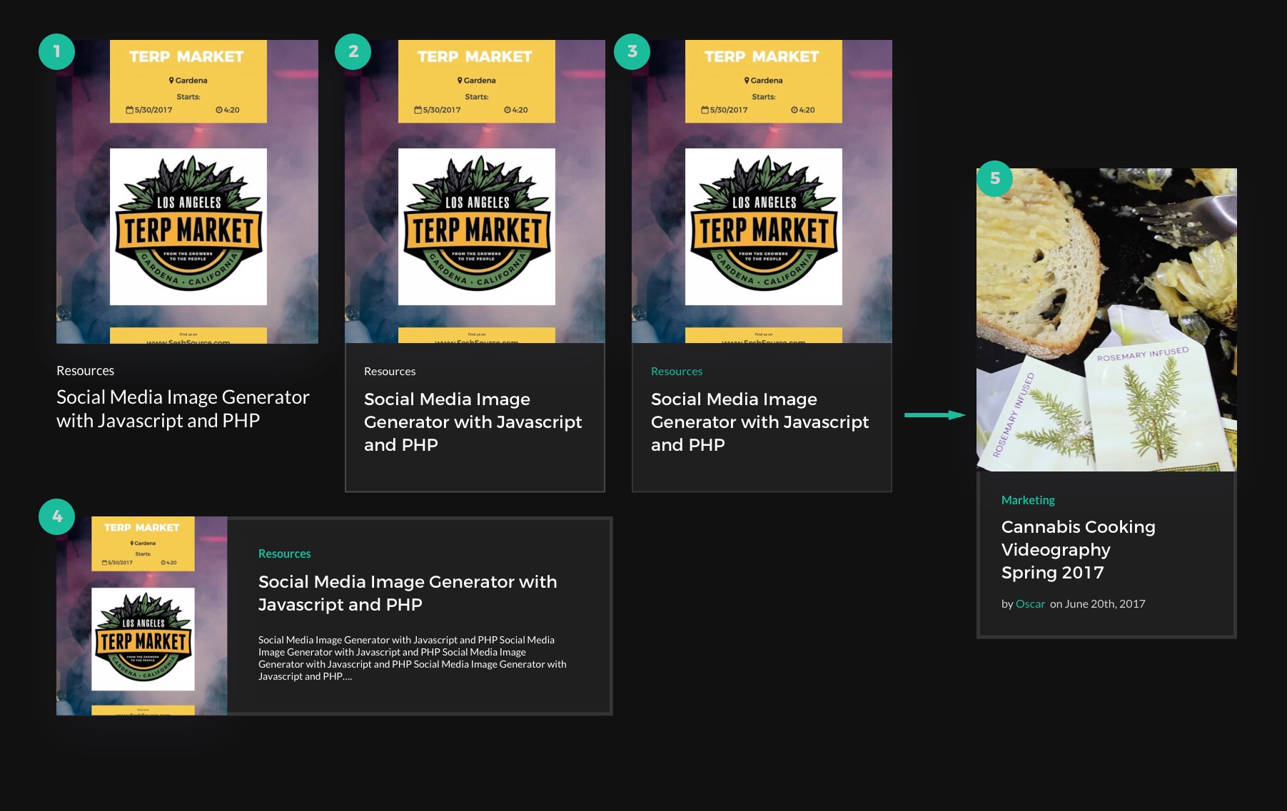
You can see the process for finding the right layout and style configuration that best suited the website's established aesthetic. The primary goal was to have a thumbnail, blog title, and category. Eventually we opted to also include the author and date, helping users differentiate older material when browsing archives or tags. I even gave a horizontal format a shot. Eventually I settled on the last design, and set off to code the Sketch design to life.
Templates vs Blueprints
Now that I had a design in mind, I created a new branch in our site's local repository and dove into Kirby's template system. If you're familiar with Wordpress and creating custom post types, it's a pretty similar process.
Each post type has a template and a blueprint. The template is your basic page template where content gets pumped out of pre-defined variables. The blueprint is a YAML file that structures the post type's admin page when creating new or editing posts.
What's cool about Kirby is that blueprint's aren't really necessary. If you never use the admin and just write your posts directly into the text files that Kirby uses to read content, the CMS will only use the template file to read it.
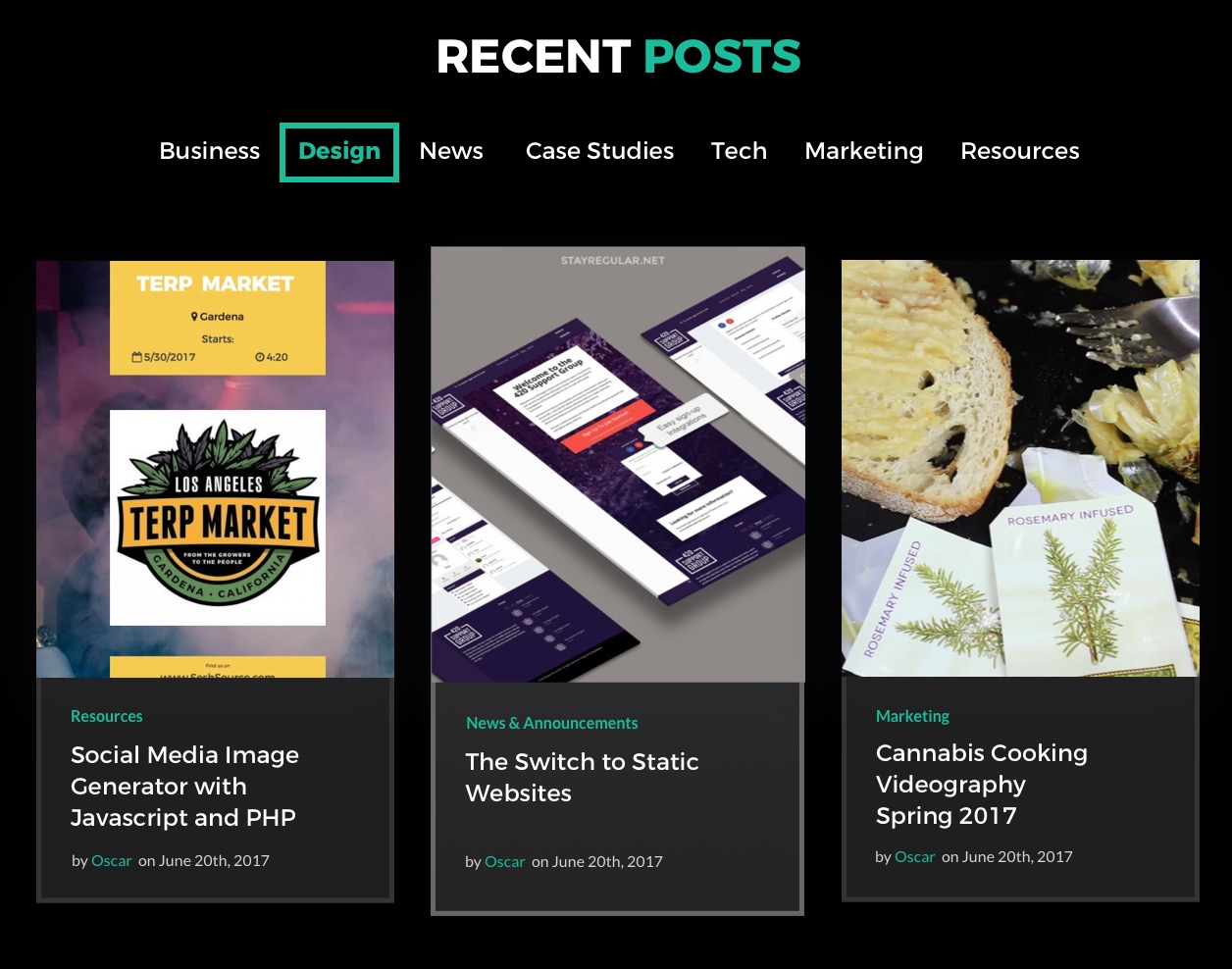
I mentioned Kirby comes baked in with a basic blog. The blog's template file essentially prints out every blog post in the style of a single post, and stacks them on archive pages. This works for some blogs, but we prefer archives to have a scannable structure for the average user eye. If someone has to scroll past 5 huge images every page to find the one post they'd like, it tests the patience of the average web surfer.
And strangely enough, the blog post type was a different setup than the portfolio post type. In our portfolio, we have a projects template, and a project template. The first is the archive, the second displays single portfolio items. The blog post type avoids using an extra template file by abandoning an archive styling and adopting this simplified loop.
We Voltron the Blog
So how do we implement this with the current Kirby structure of looping through each blog post and just printing out oversized styles in every use case? The solution was simple, and different from what we'd achieved with our portfolio section.
The blog loop begins with a check for the article count, to make sure we even have posts to serve. By adding a simple conditional statement after that check, using the same variable, we can create an archive vs single post styling.
In my case, I wanted to alter the order of the DOM elements significantly without using JS, so I used a separate template for archived posts. However, if you had minimal template changes, you could just add the conditionals where you need them, like so:
Let's Get Sorted
Now that the blog has a proper archive template, we need to give users the ability to sort through the posts somehow. Pagination is great -- searching by categories, tags, and author is better. Adding this kind of functionality in Kirby's actually pretty simple, and it's what separates it complex function driven changes on Wordpress.
First we actually add categories to the blog posts. We start with the article YAML that defines the blog post structure. I added a category select input and used all the categories I planned in the Sketch earlier. Then I had to update the older posts with the new meta data. Luckily we're only 2 blogs deep, so it was a simple matter of copy and pasting into a couple text files.
Now that we know exactly what our category slugs are, we can alter the blog post loop to filter the query by category (or tag/author). A quick view at the Kirby docs reveals how to filter content by tags. We take the concept of this code and apply it to our blog controller and use the filter articles by URL parameters (set by /blog/tag:cool_name).
The Finish Line
And with that, we have a blog archive system. We also added a menu above the blog archive that links to each category statically in a snippet file (<?php snippet('blognav') ?>), so the user's can actually navigate these cool filter's we've created. I didn't exactly reinvent any wheels here, but my goal was to show how simple it is to work with Kirby CMS compared to Wordpress.
You can achieve pretty similar functionality through much easier conventions with faster results from the static aspect. For clients with smaller, simpler projects and not looking to scale out -- Kirby's an excellent choice for quickly executing a fast, fully structured website.
Stylistic Changes 💅
Beyond the addition of the blog archive, I also took the time to make some much needed updates to the site's CSS.
-
I swapped out our static PNG logo with an inline SVG, which allows me to animate it in a way that'd be impossible without some JS normally. When you hover, fill of the SVG border turns blue (#logo-svg), but the text shapes in the SVG are grouped in a separate ID (#logo-svg-text). The text is made white, and the whole logo is wrapped in a DIV (#logo), which turns blue on hover. What is achieved is white text and the white border, and a solid blue box and white text on hover. I made it a snippet, so it can be included easily in the header and footer with a simple call (<?php snippet('logo') ?>)
-
Gists look cooler. We had default stylings for our coding snippets (gists), and thanks to a modified CSS gist by Ethan Schoonover, we have Solarized Dark themed code.
- The site is now more mobile friendly. There were a few elements I'd tossed in during a previous round of development that were missing mobile optimization. Everything look great now and should be readable on even the smallest viewports.
We've got a bit more optimization to go in a few different departments, but we're getting there. Much like most designers, we use our portfolio site as a place to experiment in a way you normally can't in client work. It's hard as I speak to resist the urge to integrate an API into Kirby and rewrite the site as a React app.
I hope you give Kirby a shot after this, and keep your eyes peeled for more blogs as we fill in each of our new categories:
Stay regular!
Oscar
Further reading
-Our blog on switching to Kirby
-Kirby Docs
-Adding/Editing Post Templates In Kirby
-Solarized Dark for embedded gists