From Wordpress to Kirby - Part 1: Designing the CMS
This was a big decision. Switching from a CMS system that powers around 25% of the websites on the internet with a huge global community, to a CMS created by a couple European dudes that most of the web hasn't even heard of. You may be asking yourself, why?
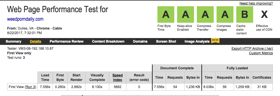
We've been using Wordpress for over 6 years now to power the backend and frontend of the WeedPornDaily website. It's flexibility allowed us to create a blog, event calendar, strain database, and business directory -- all accomplished with either 3rd party plugins or custom scripts. The only issue is with a 6 year old website? The same power we'd received from the multitude of Wordpress plugins was sapping our website of it's speed. Despite endless optimization (I got all A's on my report card), and with the limitation a shoe string budget, we were left with a load time of over 8 seconds. And the website itself was pushing over 2GBs in size, with a MySQL DB stuffed with unnecessary data and folders full of fat GIFs.

Our options were: 1. Keep pushing with Wordpress -- pushing images and data to the CDNs, adopting memcached, and rewriting the entire Wordpress theme (and a few plugins) from scratch to adopt more efficient coding practices. Or 2. Get a new CMS.
As you may have guessed by the title, we went with the new CMS. A faster, leaner, and meaner CMS that could accomplish all our goals and scale efficiently.
Picking the Easiest Execution
I looked at the monolithic amount of work that'd Wordpress would require, and set off to research more modern approaches to the blogging platform. I laid out some major goals for the new website, from being fast and fresh, to being easy to use, to scaling on our current platform (no Docker clusters here...yet). After digging through countless articles about Jekyll, Hugo, and even considering a ReactJS SPA with a headless CMS / API, I settled on a CMS I used for this very website -- Kirby.

It gave us just what we needed right out of the box - not much at all - and that's what makes Kirby so great. It's a small footprint at 3.1MB compressed, compared to Wordpress at 8.5MB. You get a blog with pagination, regular pages, and an admin panel to make new pages. That's it. No login for users, commenting system, zip, zilch. This was crucial compared to packages like Jekyll, that have no (free) admin dashboards and require bundling after each new commit (making collaborating less than easy unless I setup a crazy Github/Netlify apparatus).
Kirby was the perfect choice. It's flexibility allowed me to quickly build out all the necessary features that didn't come pre-packaged. Need a calendar? Just make a new YAML blueprint and a couple PHP templates, done. Want an API? Just add an template that queries pages and prints JSON. And a load speed of 1.5 seconds versus the Wordpress optimized 8 seconds? I'm sold on the power of static.
Sitemap and UX
After settling on Kirby as the CMS, I opened up Sketch and started to work out what structure of the site and CMS might look like. I started where we always begin with a WPD redesign, and where everyone starts on the site -- with the primary navigation of the latest version:
WPD / REVIEWS / VIDEO / CULTURE / NEWS / WEEDUCATION STRAIN DB / BUSINESS FINDER / CALENDAR / COMMUNITY
That's a lot of links for one navigation, and some of those features we've transitioned to other sites (Reddit is the community, and Kushy is the Strain and Business DB now). After cutting out the fluff, I focused on create a site map that was the simplest for every user.

Gone is the "WeedPornDaily" section, emphasizing that everything is WeedPornDaily now. Our Dev Blogs were placed under Culture > Tech > Dev Blogs. And everything else was basically in the other categories (like reviews, videos, etc).
Each subcategory (i.e. Videos > Shows) was then assigned a platform for it's content. The default would be the Kirby CMS, but we'd also integrate data and APIs from a myriad of platforms (Tumblr, Instagram, Giphy/Gfycat/Imgur, YouTube, etc). Our News subcategory would pull content from the Tumblr API for example, instead of using Kirby's blog posts.
It's something that the Wordpress site struggled with for years. We would import content from places like Tumblr into the Wordpress database, doubling up on the data, as well as requiring constant syncing (handled no probs by IFTTT). What we were left with was a website that weighed an additional 1GB from unoptimized Tumblr GIFs that get auto-imported. The goal was to replace this with a simple Tumblr API integration that displays each post natively, and loads the images from the Tumblr CDN. No more doubling of data on our dwindling server space.
Architecting the new website
I had decisions to make before I set off to code this beast. It's always better to have a pinch of preparation than an ounce of problems later.
How will posts be structured?
All the blueprints for each post type had to be planned out. Blog posts would have multiple post types, from Articles to Videos to Reviews. Each post would share a similar set of fields that keep track of the post's likes/hearts (a new feature), and SEO meta data (to make a Yoast-like solution).
Was this the best way to store and integrate data?
Should we create a WPD API that contains all the blog, Tumblr, Instagram, and YouTube posts? Kirby has the capacity to create it's own API, but it's limited by it's flat-file structure, making MySQL queries more efficient for searching for data (for say, a search bar, or even faster AJAX calls). This was something that was deemed unnecessary for the MVP, and pushed off for a later release when we have time to setup a separate API and fill it with data too.
How were we storing images?
Kirby by default stores each image locally with the blog post TXT file, but what happens when someone uploads dupes? There's no way of checking for that, especially if you have to check post by post. The best case scenario? Something similar to Wordpress where we store images in a 'media' folder, and associate blog posts with media from there. I abandoned that for the Kirby default after doing a test on a sample site and seeing that the feature would take much longer to implement into Kirby's backend admin 'Panel' (MVP! MVP!)
Play Time in Sketch
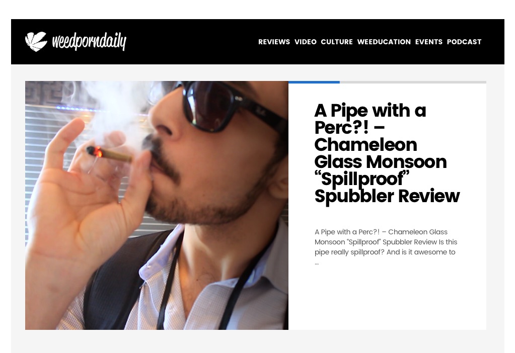
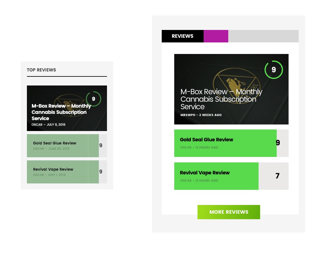
After planning out the new sitemap, it was time to make a roadmap for the front-end development process in Sketch. Using some other modern blog platforms like Vice and Digg as my inspiration, I set off to design a refreshed version of the WeedPornDaily website. I kept a lot of the same design elements and motifs, such as the black primary navigation bar, and layouts like our recent reviews widget.

Out was the compressed, stuffy content, and in was the breathing room. The goal of the new design was to keep the essence of editorial design intact, since WeedPornDaily is primarily a publication. But I focused on making bringing print design to the modern web, creating synergy with bold, clean fonts and structured elements that fall in a newspaper-like grid.


The one missing piece of the Web4.20 puzzle? Gradients. Boom. Now it feels like we're in 2017.

What's next?
Part 2 of this series will cover actual migration process of moving our content from Wordpress to Kirby, and the magic I had to make happen. Then in Part 3, I will talk about the plugins and integrations I developed to flesh out the CMS.
I hope this gives you all some ideas of different ways to handle a website instead of the go-to Wordpress setup. Kirby is an incredible CMS and I can't wait to really flex it's full potential.
Stay regular!
Oscar
