How to make Shopify Template Snippets
Customizable components are key to any modern platform. Users have an expectation to be able to adapt and change their websites using recyclable design components part of their theme's system. Users should be able to edit their sliders or page layouts on the fly, moving and editing things freely as they need, without development experience.
It's something that services like Squarespace and Wix embrace. Even Wordpress is trying to implement a version of it with their Gutenberg editor, and we've had it for years with the WPBakery Page Builder (formerly Visual Composer) plugin.
Websites are a collection of components, there's no reason we can't abstract control away from the code and in the reach of a click.
Shopify offers a version of this with their 'snippets'. A snippet is a reusable component that can be included in any template file. And on the frontpage of the website, you can use customizable snippets to compose a layout for the main landing page.
How does it work?
On the frontpage it's a very similar process to something like Squarespace or Wix. You have 'content blocks', each block is a snippet, and you arrange them in whatever order you'd like. If you click on a block, it reveals more options, like inserting text or images.
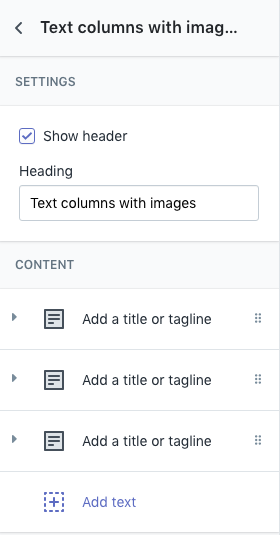
The widget
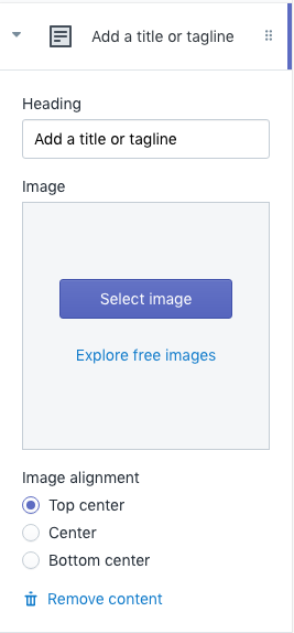
A block inside the widget
On any other page however, it still requires you to manually insert the include snippets into your Liquid page templates ({% section 'your-snippet-here' %}), and it doesn't offer the same level of customization. You can insert variables, but it's a different API than the block settings, so you'd have to account for that as well.
Making the snippets
Creating a snippet is a snap. Open up your Shopify theme folder, navigate to the snippets folder, and create a new Liquid file with any HTML you'd like. This is great for components that repeat across the website, like newsletter blocks or sidebar widgets.
Here's an example of a block that contains a text header and a flex grid of boxes with images as background:
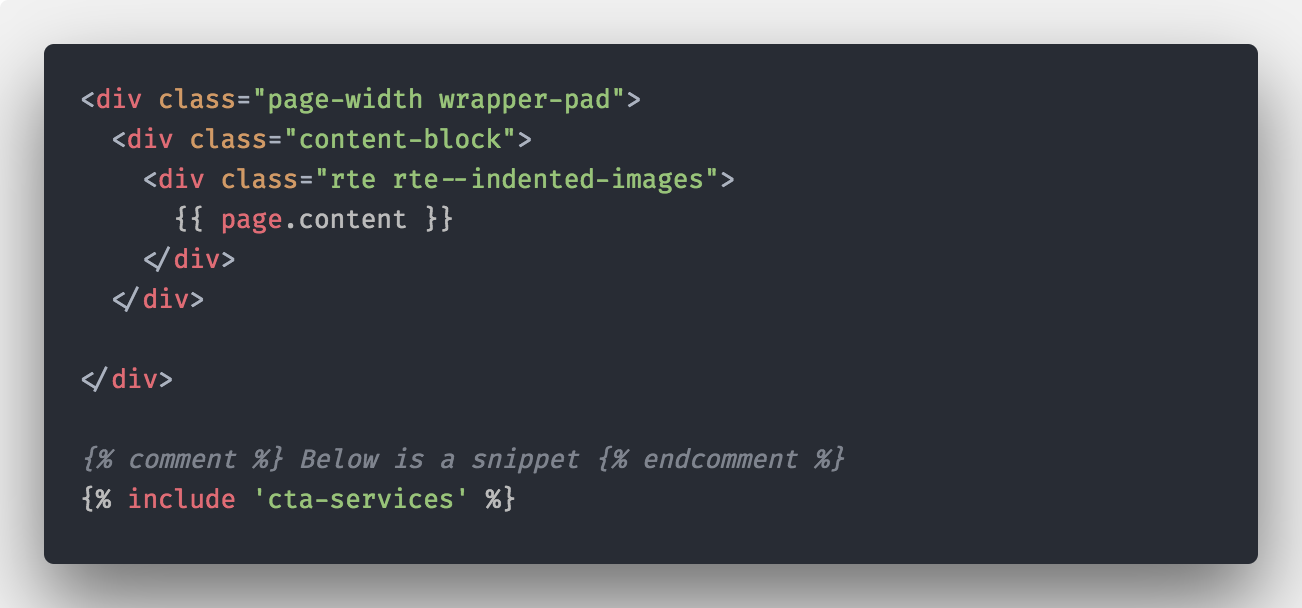
<div class="page-width">
  <div class="section-block">
      <div class="section-block__header section-block__header--padded text-center">
        <h4 class="h1--mini section-block__title">Text columns with images</h4>
      </div>

    <div class="flex column-flex">
        <div class="flex__item column-overlay text-center">
            <noscript>
              <div class="column-flex__image" style="background-image: url(http://images.google.com/imageurl.jpg); background-position: center center;"></div>
            </noscript>
            <div class="column-flex__image lazyload"
              style="background-position: center center; background-image: url('http://images.google.com/imageurl.jpg);">
            </div>
          <div class="column-flex__content">
            <p class="h5">Image Title</p>
          </div>
        </div>
    </div>
  </div>
</div>
West Code Customs
Customizing a snippet is where things get interesting. To make a snippet customizable, you have to add a schema to the bottom of the snippet. Copy and paste the following into the bottom of your current snippet:
{% schema %}
  {
    "name": "Text columns with images",
    "class": "index-section",
    "max_blocks": 24,
    "settings": [
      {
        "type": "checkbox",
        "id": "title_enable",
        "label": "Show header",
        "default": true
      },
      {
        "type": "text",
        "id": "title",
        "label": "Heading",
        "default": "Text columns with images"
      }
    ],
    "blocks": [
      {
        "type": "text_block",
        "name": "Text",
        "settings": [
          {
            "type": "text",
            "id": "title",
            "label": "Heading",
            "default": "Add a title or tagline"
          },
          {
            "type": "image_picker",
            "id": "image",
            "label": "Image"
          },
          {
            "type": "radio",
            "id": "image_align",
            "label": "Image alignment",
            "options": [
              { "value": "top center", "label": "Top center" },
              { "value": "center center", "label": "Center" },
              { "value": "bottom center", "label": "Bottom center" }
            ],
            "default": "top center"
          }
        ]
      }
    ],
    "presets": [
      {
        "name": "Overlay Columns",
        "category": "Text",
        "blocks": [
          {
            "type": "text_block"
          },
          {
            "type": "text_block"
          },
          {
            "type": "text_block"
          }
        ]
      }
    ]
  }
{% endschema %}
Once you add this to your snippet, if you go to your frontpage and click "Add Section", you should see the snippet title you defined in the list.
What does the Schema mean?
The first chunk of JSON is pretty self explanatory. The name is the title you'll see in Shopify's backend. The max_blocks limits the number of sub-components you can create (e.g.: a recent article snippet limited to 9 posts).
The settings array is where you put your top level configurations for the snippet. In this example, we give the user the type in their own header, and enable or disable the visibility of it.
The blocks array defines the extra "sub-blocks" you can create within your content blocks, or snippet. In this example, we create a block where the user can define header text, upload an image, and pick the image alignment. Depending on the max_blocks defined earlier, you can make that many "sub-blocks".
The presets array creates a "default" setup for your snippet. If the widget is 3 column and works best with 3 blocks, you can create 3 sample blocks. When the user creates a new snippet, the 3 sample blocks will be automatically created for them (filled with the defaultvalues you define).
Adding the variables to your snippet
You can access top-level snippet configurations using {{ section.settings.title | escape }}, swapping title for the ID name of the desired setting. To get to block settings, you loop through the blocks and then access the for loop, like so:
{% for block in section.blocks %}
      {{ block.settings.title | escape }}
{% endfor %}
If block contains variable, do something
When you combine the parameters you get from customization with Shopify's liquid templating system, you can achieve some fairly dynamic components with a minor tinkering. What happens if the user doesn't define any blocks? Or forgets to upload an image? We can handle all these conditional cases with Liquid's {% if %}.
How do we handle the on/off toggles, like the header?
Make a simple if statement checking for the variable. If it's switched to "on", the variable will be true, so any code inside will be executed:
{% if section.settings.title_enable %}
      {{ section.settings.title | escape }}
{% endif %}
What if an image isn't defined?
You can check for the variable and see if is equal (or in this case, not equal) to blank, a Shopify value that checks if the value is empty.
{% if block.settings.image != blank %}
      {{ block.settings.image | img_url: '600x600' }}
{% else %}
      <img src="Placeholder.svg" />
{% endif %}
What if the user doesn't create blocks?
The blocks variable contains a size attribute that lets you see how many blocks there are. You can check if it's equal to 0 in this case:
{% if section.blocks.size == 0 %}
      {% include 'no-blocks' %}
      {% comment %}
            We include a placeholder snippet that contains something like a statement saying "Sorry, no posts found".
      {% endcomment %}
{% endif %}
This also comes in handy if you need to check for grid consistency (e.g.: if blocks == 3, then do 3-column class attributes).
The final code
When we string together a couple of simple if statements, and swap the hard-coded data with our Shopify snippet configuration variables, we have a fully customizable block:
<div class="page-width">
  <div class="section-block">
    {% if section.settings.title_enable %}
      <div class="section-block__header section-block__header--padded text-center">
        <h4 class="h1--mini section-block__title">{{ section.settings.title | escape }}</h4>
      </div>
    {% endif %}

    <div class="flex column-flex">
      {% for block in section.blocks %}
        {% if block.settings.image != blank %}
          {% assign img_url = block.settings.image | img_url: '600x600' %}
        {% endif %}
        <div class="flex__item column-overlay text-center" {{ block.shopify_attributes }}>
          {% if block.settings.image != blank %}
            <noscript>
              <div class="column-flex__image" style="background-image: url({{ block.settings.image | img_url: '600x600' }}); background-position: {{ block.settings.image_align }};"></div>
            </noscript>
            <div class="column-flex__image lazyload"
              style="background-position: {{ block.settings.image_align }}; background-image: url('{{ block.settings.image | img_url: '300x300' }});"
              data-bgset="{% include 'bgset', image: block.settings.image %}"
              data-sizes="auto"
              data-parent-fit="cover">
            </div>
          {% else %}
            <div class="column-flex__image">
              <div class="placeholder-background">
                {{ 'placeholder.svg' | asset_url }}
              </div>
            </div>
          {% endif %}
          <div class="column-flex__content">
            <p class="h5">{{ block.settings.title | escape }}</p>
          </div>
        </div>
      {% endfor %}
    </div>

    {% if section.blocks.size == 0 %}
      {% include 'no-blocks' %}
    {% endif %}
  </div>
</div>

{% schema %}
  {
    "name": "Text columns with images",
    "class": "index-section",
    "max_blocks": 24,
    "settings": [
      {
        "type": "checkbox",
        "id": "title_enable",
        "label": "Show header",
        "default": true
      },
      {
        "type": "text",
        "id": "title",
        "label": "Heading",
        "default": "Text columns with images"
      }
    ],
    "blocks": [
      {
        "type": "text_block",
        "name": "Text",
        "settings": [
          {
            "type": "text",
            "id": "title",
            "label": "Heading",
            "default": "Add a title or tagline"
          },
          {
            "type": "image_picker",
            "id": "image",
            "label": "Image"
          },
          {
            "type": "radio",
            "id": "image_align",
            "label": "Image alignment",
            "options": [
              { "value": "top center", "label": "Top center" },
              { "value": "center center", "label": "Center" },
              { "value": "bottom center", "label": "Bottom center" }
            ],
            "default": "top center"
          }
        ]
      }
    ],
    "presets": [
      {
        "name": "Overlay Columns",
        "category": "Text",
        "blocks": [
          {
            "type": "text_block"
          },
          {
            "type": "text_block"
          },
          {
            "type": "text_block"
          }
        ]
      }
    ]
  }
{% endschema %}
You should have something that looks like this:

Easy as Schema
I hope this helps you create some flexible components for your Shopify template. These customizable blocks empowers less tech-savvy editors with the ability to contribute on a new level effortlessly.
Is something not working correctly for you? Hit us up on Twitter and ask for help. Or contact us today if you need professional consultation and development for Shopify.
Stay regular,
Oscar
Keep Reading: